











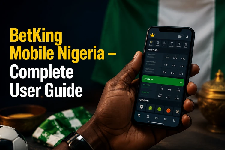
Mobile betting is a practical option for many Nigerians, and BetKing has built its platform around access from phones and tablets. Whether you use an Android handset in Lagos or an iPhone in Abuja, the BetKing mobile website is available through a modern browser without requiring an installation. This guide explains the standard mobile layout, Lite browsing, desktop mode, device support, and simple ways to resolve common access problems.
What Is the BetKing Mobile Website?
The BetKing mobile website is the browser-based version of the platform, with a responsive layout that adjusts to the width of a phone or tablet. Navigation buttons, odds, and the bet slip are arranged for touch controls, so most pages can be used without constant zooming or sideways scrolling.
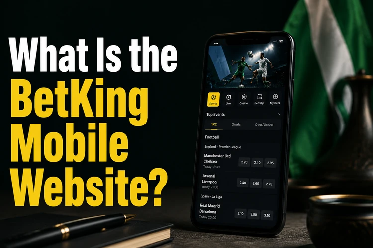
The mobile view keeps commonly used areas such as sports markets, live betting, account balance, and offers close to the main menu. You can register or log in from a phone, then access your account from another device by signing in again. The exact placement of buttons may change when the platform is updated, so follow the labels shown on the current page rather than relying on an older layout.
BetKing Lite - Betting on a Low-Data Connection
The Lite interface is a simpler way to browse when the connection is slow, unstable, or expensive. It reduces visual elements and other page demands, which can make the main markets easier to reach on an older smartphone or a congested mobile network.
Lite browsing is best suited to straightforward tasks such as checking pre-match markets, reviewing a bet slip, and viewing account information. Rich visual features may be simplified or unavailable, and performance still depends on the phone, browser, and network. If the standard page is slow, try Lite first, then check the connection and browser before assuming that the account has a problem.
The Old Mobile Interface - Why It Still Comes Up
BetKing has changed its mobile interface over time. Earlier layouts used simpler navigation bars, different colour schemes, and fewer options on each screen, so long-time customers may remember the older experience.
Those historical layouts should not be treated as a separate active service. The current responsive design is intended to work across a wider range of screen sizes. If a page looks different from one you used in the past, the difference is usually the result of a platform update rather than a hidden old version that needs to be found.
Mobile Website vs Desktop Website
Both views are designed to provide access to the same account, markets, and available account features. The main difference is how much information fits on the screen at once.
| Feature | Mobile | Desktop |
|---|---|---|
| Navigation | Collapsible menu for touch controls | Full menu bar and wider layout |
| Page loading | Designed for mobile connections | More space for larger page elements |
| Bet slip | Stacked or expandable panel | Usually visible beside the markets |
| Screen layout | Single-column sections | Multiple columns and sidebars |
| Best use | Quick access while travelling | Comparing several markets on a large screen |
A larger display can be more comfortable for comparing leagues, while the mobile view is easier to use with one hand. Choose the layout that gives you a clear view of the odds and selections before confirming a bet.
Using Desktop Mode on a Phone
Most major mobile browsers let you request the desktop layout. In Chrome on Android, open the three-dot menu and select Desktop site. In Safari on iPhone, use the AA menu in the address bar and choose Request Desktop Website. Firefox and Edge provide a similar setting in their browser menus.
Desktop mode can help on a large tablet or when a particular control is easier to find in the wider layout. On a small phone, however, text and buttons may become difficult to read, and more zooming can make the bet slip awkward to use. Treat desktop mode as a task-specific option rather than a permanent setting.
Device Compatibility
The mobile site is intended for current browsers such as Chrome, Firefox, Safari, and Edge on Android and iOS. Tablets can use the same responsive layout, which expands or rearranges content according to the available screen width.

Older phones may struggle with pages that use more scripts or interactive elements. Keeping the operating system and browser updated helps with page rendering and secure connections. If your handset remains slow after closing unused tabs and restarting the browser, the Lite interface may be more suitable. You can also explore the dedicated app if you prefer a native installation.
What You Can Do from a Mobile Browser
The mobile platform supports common betting tasks, including football, basketball, tennis, other sports, and live markets where available. Virtual games and casino content may also be accessible in the same session, although the way each section loads can depend on the device and connection.
Account tools are available from the mobile account area. Depending on the service and account status, you can review bets, manage deposits or withdrawal requests, update personal details, and view available offers. Responsible gambling controls, such as deposit limits or self-exclusion settings, should be checked before placing bets if you want to set personal boundaries. New customers can complete the registration process from a phone.
Tips for Better Mobile Performance
A few maintenance steps can prevent slow pages and display errors. Clear cached browser data when an old page keeps appearing, and reload after switching between Wi-Fi and mobile data. If only one page is affected, a normal refresh or closing duplicate tabs may be enough.
- Update your browser: current versions generally handle responsive layouts and secure connections more reliably.
- Check the connection: test another network or move to a stronger signal before retrying a time-sensitive page.
- Use Lite when necessary: a simpler interface can be more practical on an older phone or limited data plan.
- Use desktop mode selectively: switch it on for a specific task, then return to the mobile view if controls become too small.
- Protect your session: avoid saving account details on a shared phone and log out when you finish.

If a problem continues after these checks, use the contact page and describe the phone model, browser, connection type, and error. Specific details make it easier to identify whether the issue is related to the device, the network, or the account.
FAQ
It is the browser-based version of the BetKing platform for phones and tablets. Open the site in a supported browser, and the responsive layout adjusts to the available screen size without requiring an app installation.
Lite is a simpler version intended for slower connections and older smartphones. It reduces some visual and page demands while keeping practical tasks such as viewing markets and checking account information available, though some rich features may be simplified.
Earlier mobile layouts are historical rather than a separate active service. The current responsive design is intended to cover different screen sizes, and the appearance may change when the platform is updated.
Yes. Chrome, Safari, Firefox, and Edge provide a desktop-site setting in their browser menus. It can be useful on a tablet or for a specific task, but the smaller text and controls may be inconvenient on a phone.
Recent Android and iOS phones, tablets, and current versions of Chrome, Safari, Firefox, and Edge are the most suitable choices. Updating the browser is useful when pages render incorrectly. Older devices may work better with the Lite interface.
The mobile account area supports tasks such as reviewing bets, managing available account options, and accessing responsible gambling controls. The exact tools shown can depend on the account and service. Check limits or self-exclusion settings before betting if you need stronger personal safeguards.